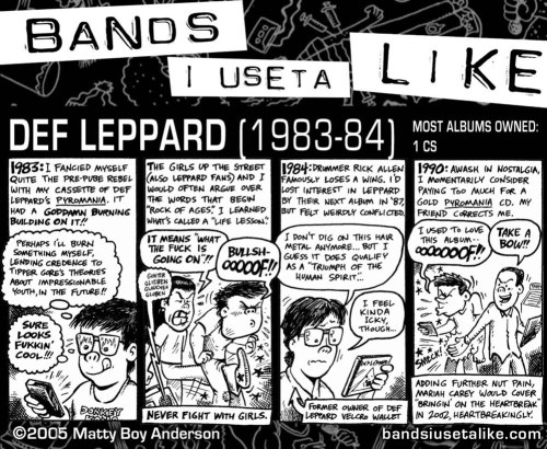
Let me get this out of the way first. For the uninitiated, here’s why we love Def Leppard.
How about a closer look at one of the finest album covers of all time (art by Bernard Gudynas)?

Thomas Dolby on keys, did you know that?
If “pyromania” wasn’t such an awesome word, there would be far fewer pyromaniacs. I knew pyros in grade school. I flirted with flames myself for a few years. It wouldn’t be nearly as seductive if it was called “setty-firey”, or “fartholing”.
Pyromania is certified diamond by the Recording Industry Association of America (RIAA), meaning over 10 million copies sold. Before you get too excited about that, Britney Spears and the Backstreet Boys are in that club as well. This is why perspective is so important. Def Leppard earned that diamond. They didn’t buy it, like so many others have. Here’s the acid test: how’s it sound in 30 years?
Lead singer Joe Elliott may have been inspired by Led Zeppelin when he conjured up a moniker, but whomever designed Def Leppard’s logo gave them a distinctive and lasting look. I really did have a Def Leppard velcro wallet. I won it at a state fair, choosing it over prizes like a similarly-branded mirror, or one of those stretched-out glass Pepsi bottles that used to be everywhere. I stopped using it in the mid-90s, even though the silk-screened logo had worn off. Men do not use velcro wallets, no matter how cool the band advertised may be. The sound they make when opened is remarkable pussy repellent.

Isn’t that a beaut? That is made for doodling onto a denim jacket. Here’s how you know it’s a successful type treatment: in the present day, people compete to turn it into a font.

The Def Leppard logo was pyramid-shaped on their debut album, On Through The Night, but changed to the linear model above after that. Their second album, High ‘n’ Dry, features uncharacteristically ugly art from the legendary English design group Hipgnosis. 1987’s Hysteria has a cover that looks like Tron had a terrible transporter accident. That’s the one with “Pour Some Sugar On Me”. The less said about it the better.
By 1992’s Adrenalize, “album illustration” has been replaced by “art direction”. This is why no one can remember what it looks like, or what songs are on it. When Def Leppard ditched the cherished logo in 1996, with the release of Slang, the result was their worst-selling album yet. The mistake was realized, the art director got Photoshop, and the logo returned for Euphoria in 1999.

Alternate title: “Ecch”.
Def Leppard released their latest album less than two months ago, and it charted at #10. I haven’t heard it yet, but I’d call that very impressive. It’s their eleventh album, same bunch of dudes since 1977, minus one dude and an arm. The art direction is still basic, but it’s a step in the right direction. I like how it looks like the logo got fed up with how it’s been treated over the years, and smashed the CD case.

Once, my dad referred to them as “Def Kajagoogoo”. I still can’t believe it.
It’s true, though, no foolin’.
https://youtu.be/8puU4ru45M0


You must be logged in to post a comment.